
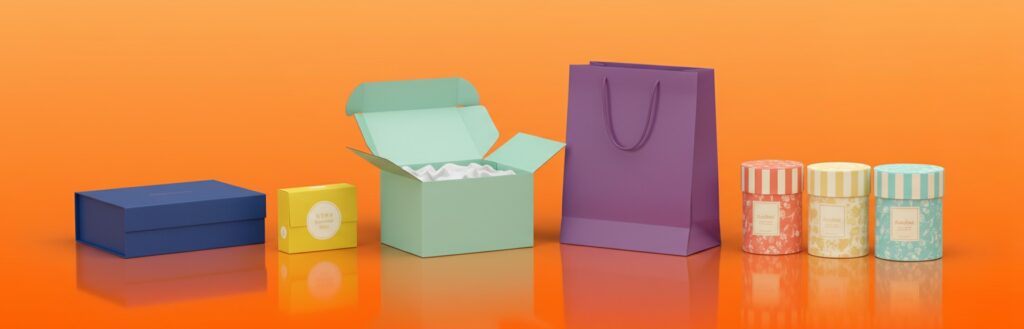
Colour Psychology in Custom Packaging: Attract More Buyers Instantly
Colors mean a lot in the way products are viewed and remembered. A correct choice of color in a custom packaging box will turn what was an ordinary box into a strong selling tool. A good color choice draws eyes to it, builds up trust, and helps remember a product. Each color represents a certain message. When that message coincides with the story of a brand, then the customers feel connected, and very likely will make a purchase.
Why Color Psychology Matters in Packaging Design
Color psychology shows how different colors affect the mood and behavior of a person. Through packaging design, it helps a brand in evoking emotions and inviting the right audience. A tranquil color can make a product look relaxing, while a bold shade will reveal energy and confidence.
The colors of packaging are not only good to look at, but they actually drive purchasing decisions. Many shoppers will choose a product just because the color feels right. Understanding color psychology is going to be the key to creating packaging that sells instantly.
How Colors Affect Buying Behaviour
Colors do much more than decorate a box: they affect judgment about a product even before it has been touched. Soft pastel shades can make it look gentle and safe, while bright red brings excitement and urgency. The human brain reacts within just a few seconds to colors, and that quick reaction often makes all the difference as to whether or not the product is noticed.
Red: The Color of Energy and Excitement
Red is a bold, intense color—a color of power, passion, and action. Red pops out on packaging from the crowded shelves. Countless snack, beverage, and cosmetic brands draw on red as one avenue in which to inject energy into their products and make them more appealing.
This should, however, be treated with care: too much red may look aggressive or even overwhelming. A touch of red, whether in the text, borders, or a logo, will make packaging pop without losing its balance.
Blue: A Color of Trust and Calm
The color blue inspires calmness and makes people feel safe and trusting; actually, it even conveys dependability and professionalism. That must be why so many health, skincare, and technology brands are using blue on their packages to mean the product is reliable and of good quality.
Lighter blues are fresh and friendly, while darker blues feel serious and strong. Because blue is one of the most liked colors in the world, it is a safe but powerful choice to go with for custom packaging.
Green: The Color of Nature and Health
Green represents nature, freshness, and balance directly. This color fits just right with eco-friendly or organic products. Green packaging gives an idea of health and safety; that is why this color will be great for food, skin care, and wellness items.
Soft greens evoke feelings of calm and relaxation, while deep greens denote growth and luxury. For “green” brands that really care about the planet, green immediately conveys a sense of sustainability and concern for the environment.
Yellow: The Color of Happiness and Positiveness
Yellow is warm and jolly. It calls one’s attention and spreads energy. In packaging, yellow usually depicts fun, creativity, and cheer. It is great to use in brands wanting to appear friendly and energetic.
Because too much yellow is hard on the eyes, it works better as a highlight color. Yellow mixed with white or black can create packaging that’s bright and modern without feeling too loud.
Black: The Color of Luxury and Power
Black is classy, elegant, and timeless. It gives a premium and powerful feel to your product. Most of the luxury brands use black because it reflects class and quality.
More importantly, matte black packaging will look modern and high-end. It looks even more striking when used along with gold, silver, or white. Black will be the perfect color for those products offering exclusivity and sophistication.
White: The Color of Purity and Simplicity
White: the color of simplicity, cleanliness, and honesty. It gives a refreshing and pure look to the products. Minimalist brands use white packaging to show clarity and trust. It reflects other design elements like logos and fonts very clearly.
White packaging can feel modern and calm. It works for skin care, baby products, and health-related products where trust and purity mean everything.
Pink: The Color of Softness and Care
Pink is all about love, care, and sweetness. This color is normally used in packaging beauty and fashion items or skincare. Light pink displays softness and is calm while bright pinks are fun and bold.
Pink is perfect for those companies that would wish to appear kind, young, and friendly. This will help in creating an emotional link if the aim is to make customers feel looked after and appreciated.
Purple: The Color of Creativity and Royalty
The color purple has long represented luxury, mystery, and imagination. It feels creative and elegant at the same time. In packaging, purple works for products which want to feel special or unique.
Lighter purples are more romantic and soothing while darker purples display richness and confidence. That is why purple is so common in many perfume, chocolate, and wellness brands showing quality and creativity.
Orange: The Color of Fun and Enthusiasm
Orange is warm and cheerful. It combines energy from red and happiness from yellow. In packaging, orange seems really alive and friendly—open to grabbing the attention of young audiences.
Orange also inspires adventure and confidence. It works well within sports gear, beverages, and casual brands that want to feel approachable and full of life.
Brown: The Color of Strength and Earthiness
Brown reminds one of natural materials and simplicity. It provokes feelings of stability, safety, and warmth. In packaging, the color brown is used to show something organic, handmade, or sustainable.
Ecological packaging is the reason for such high demand in kraft paper boxes and brown hues. They look natural and honest visually, taking care of the environment. Most brands using brown try to show that their products are real and down-to-earth.
How to Choose the Right Color for Custom Packaging
It’s not all about the looks when choosing a color for packaging; it’s about the message of that color. It should correspond to the purpose of the product and target audience.
Examples:
• Food packaging often uses red, orange, or yellow because these colors increase appetite.
• Beauty brands select pink, white, or purple to show softness and care.
• Technology brands use blue, black, or silver to show trust and quality.
The best packaging color communicates both the brand story and the customer emotional state. Testing several shades and listening to customers’ feedback will help find a perfect match.
How to Make the Most of the Colors
One color may say it all, but an intelligent mix can make packaging unforgettable. Contrast may make the key elements pop, while harmony can be appealing to the eyes.
For example:
• Black and gold make for an elegant combination.
• Green and white, freshness and eco-friendliness.
Correctly combined, colors would make the eye move smoothly and channel the focus on where it belongs: to the brand logo or slogan.
Cultural Meaning of Colors
The meaning of colors varies across cultures. For instance, in the West, white is a color of purity, but it symbolizes mourning in several Asian countries.
In the same way, the color red depicts good luck and joy in China, though it symbolizes perilousness in others.
Understanding the cultural meaning of colors helps international brands avoid confusion and communicate better with buyers abroad.
Color Trends in Modern Packaging
Many of the modern packaging trends were informed by changes in lifestyle and shifts in customer values.
• Soft pastels and muted tones feel calm and natural.
• Earthy tones like beige, brown, and green show eco-friendliness.
• Metallic shades such as gold, rose gold, and silver are popular in luxury packaging.
By keeping up with color trends, a brand shows its creativity and at the same time stays modern and relatable.
Role of Color in Online Shopping
Colors become more powerful in online stores. Since customers cannot even feel the products online, let alone touch them, the only thing making their first impression is the visual appeal.
This means that bright, balanced colors make product photos pop on digital screens. Soft backgrounds and bold accents make online packaging images more clickable.
That is why the right color choice online will drive more views, more clicks, and more sales.
Common Mistakes in Using Colors
Brands sometimes use colors that may be beautiful but do not have a brand message. Bright tones might be overused, and too many colors mixed together actually confuse the customer.
Poor contrast can make the text very hard to read.
The most effective designs present colors in a simple and balanced way: reducing a palette to only two or three major shades creates a coherent and professional design.
Conclusion: The Smart Use of Color Wins Hearts
Color is more than decoration; it is silent communication. Each shade evokes different feelings among customers for any product. Smart color usage in customized packaging draws instant attention, installs trust, and encourages impulsive buying decisions.
The right color will express the story of the brand with clarity and emotion. Be it to look natural, fun, or even luxury, the secret lies in color psychology. With thoughtful design combined with deep understanding of color meanings, any product can stand out and win hearts within seconds.
FAQ Section
Q1: Why is color important in packaging?
Color evokes feelings and choices in people. It helps products get noticed and generates emotion.
Q2: What color works best for eco-friendly brands?
Green and brown are best for natural, sustainable, and organic packaging.
Q3: Which color shows luxury and elegance?
Black, gold, and deep purple are colors of richness and exclusivity.
Q4: How do colors influence online sales?
Vibrant, balanced colors also encourage more clicks and help products pop on-screen.
Q5: Does color mixing improve package design?
Yes. The proper mix of color creates balance, contrast, and overall effect.