
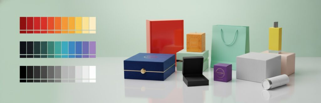
Color Psychology in Packaging: Choose Colors That Convert
Basically, colors unconsciously drive the person’s decisions. It is the colors in product packaging that make it look more salable. Choosing appropriate colors brings more sales. Colors send messages of quality, mood, and value regarding a product. More often than not, color drives customers to choose rather than reading labels or checking prices. A better understanding of color psychology improves marketing strategies for better conversion.
Why Color Matters in Packaging
Colors catch people’s attention much quicker than words. The human brain can react to colors in milliseconds. Bright and bold colors would always have more eyes caught on them. Soft and calm colors would represent trust and care. Color choice creates a perception that can influence purchase behavior. Colors also arouse emotions; therefore, customers feel attached to a product. Different colors create various kinds of moods, and these moods would affect buying decisions.
1 Red: Energy and Urgency
Red is the color of excitement and energy; it drives one toward making quick decisions. Red works effectively in promoting sales or any offer, which states that the offer is available for a limited period. Products with red packaging look bold and active. The color red represents passion, action, and intensity. Most food and beverage brands have red in their brand identity to stimulate appetite and a sense of urgency.
2 Orange: Inspirational and Playful
Orange is associated with fun and creativity, for young and adventurous types of customers. Snacks, toys, casual items packed in orange can be given extra attractiveness. Orange stands out on the shelves, not being too aggressive. It gives a friendly, cheerful feeling to people, who become more willing to try something new. The look of bright orange can be balanced with neutral colors.
3 Yellow: Happiness and Positivism
Yellow evokes joy in the minds of people. The color represents optimism and warmth. Yellow packaging works for children’s products or cheerful brands. The bright yellows attract attention in crowded spaces. Yellow can even give a product the perception of energy and brightness, providing freshness and liveliness. Too much of yellow, however, needs to be balanced.
4 Green: Health and Nature
Green represents health, nature, and freshness. It works for organic, eco-friendly, or healthy products. Green packaging could signal sustainability and calmness. It also ranges from energetic lime to calming forest green. Green speaks to growth and balance, too, which makes it perfect for wellness, food, and environmental care products.
5 Blue: Trust and Security
Blue conveys trust and dependability, which makes it appropriate for professional products or technology products. Light blue assumes a soothing personality, while dark blue conveys an impression of strength and dependability. Blue can give confidence to the consumer with the packaging. Most financial, tech, and health brands use blue as a means of conveying stability and safety. Blue also acts very well as a secondary color for contrast and readability.
6 Purple: Luxury and Creativity
Purple speaks to luxury and creativity; therefore, it is quite effective for cosmetics, beauty, and premium products. Deep purple feels rich, and lighter shades of lavender feel soothing. Purple contributes to making the product stand out and be premium. A use of purple denotes elegance and sophistication without showing flashiness. Mixing with metallic tones, like silver or gold, ups the high-end ante.
7 Pink: Sweetness and Romance
Pink is a color of sweetness and romance. It would work for products to be gifted, cosmetics, and products for young women. Bright pink provokes energy; pastel pink characterizes softness and delicacy. Pink demands attention with a friendly tone of voice. It’s suitable for playful, nurturing, and feminine product categories. Pink and white or neutral shades ensure better readability and visual science appeal.
8 Black: Class and Elegance
Black represents sophistication and elegance. It is used for premium products and fashion products. Black packaging gives a sleek and professional look. A mix of black color with gold or silver increases the presence of luxury. Black can be used as a contrasting color which makes any other color appear to be more present. Too much black has to be balanced because it feels heavy.
9 White: Simplicity and Purity
White is a colour of simplicity and purity. It works for health and beauty products, as well as technical products. White packaging feels clean and modern. White makes other colours and designs stand out. In minimalist design, white creates an impression of space and organization. The use of white generally aims to drive messages of quality and cleanliness.
10 Brown and Earth Tones: Natural and Organic
Earthy and reliable, brown tones function well with handmade, organic, or eco-friendly products. The idea of colours of nature creates a product that may seem more honest and trustworthy. Earth tones can be warm and comforting, too. Recycled paper and kraft textures go hand in hand with these colours to further the natural, sustainable message.
Colour Combination Choices
Mix colours for balance and appeal. Contrasting colours create eye appeal. Complementary colours are easy on the eye. A neutral background with bright accents makes text and logos pop. Properly combined colours help to improve readability and interest. A carefully chosen colour palette strengthens product differentiation and brand identification.
1 Colour and Brand Identity
Colours power strong brand recognition. Consistency in colour use has helped customers remember a particular product. Brand colors communicate personality and values. Packaging designed with brand colours strengthens an identity. Major brands use the same colour palette throughout packaging, their online presence, and advertising, building trust and recall.
2 Cultural Considerations in Colour
Colours can mean various things in different cultures. For some countries, it is a colour of luck, while for others it is a colour of danger. Green is positive in the cultures that have a focus on nature but elsewhere may imply inexperience. Understanding cultural color meanings can help avoid confusion and reach a more global customer. This involves the knowledge of regional color preferences to increase the acceptance of one’s product and effectiveness in marketing.
3 Color Testing and Customer Preferences
Testing colors is of importance in determining what really works. Surveys, focus groups, and A/B tests show customer reactions. The colors of custom packaging can be changed to fit consumer preference. Testing reduces risk and enhances conversion rates. Real customer feedback shows which color drives attention, communicates values, and persuades to buy.
Psychology of Color and Consumer Behavior
Colors elicit emotions and drive decisions in subtle, yet powerful ways. Warm colors like red, orange, and yellow spark excitement and urgency. Cool colors like blue, green, and purple generate calm and trust. Brilliant colors achieve instant attention while desaturated colors convey sophistication and refinement. Packaging that matches product purpose and consumer mood encourages better engagement and higher sales. Knowing color psychology helps to design packaging that leads to action and memorable experiences.
Color Trends in Packaging
Current packaging trends are focusing on minimalism, bold color choices, and nature-inspired palettes. Ecofriendly and earthy tones increase in their popularity, reflecting sustainability and ecological consciousness. Bright and neon colors appeal to younger audiences and create a modern look. Following trends while maintaining brand identity ensures consistency and prevents confusion. Trendy colors, when used thoughtfully, make products stand out without sacrificing brand recognition.
1 Practical Tips for Choosing Packaging Colors
• Identify the product type and target audience before choosing colors.
• Color choices should identify with brand values and messaging.
• One dominant color balances best with one or two supporting colors for clarity.
• Too many colors confuse customers and dilute the impact of your message.
• Test various shades and tones until you find the most appealing combination.
• Consider shelf visibility and how colors appear in different lighting.
• Seasonal or limited edition colors can be used to boost engagement during special campaigns or events.
2 Case Examples of Effective Color Use
Food brands use red and yellow to stimulate appetite and to convey energy. It follows that shades of blue are used by technology brands wanting to convey reliability, trust, and innovation. Cosmetic and beauty brands use purple and pink to denote luxury, creativity, and femininity. Green and brown tones are favored by eco-friendly and organic brands since these colors represent nature, health, and sustainability. From these examples comes the conclusion that astute color selection supports brand objectives and furthers product success by affecting customer perception and buying behavior.
Conclusion
Color choice in packaging influences directly how the products are perceived and how well they sell. Color psychology is how brands speak about value, emotion, and identity. The proper colors make memorable experiences and drive purchases. Packaging which considers color, culture, and trends, converts much better and strengthens brand recognition. Each color decision contributes to customer trust, engagement, and long-term loyalty.
FAQ Section related to Color Psychology
Q 1: What is color psychology in packaging?
Color psychology looks at colors and their effects on feelings and purchasing decisions.
Q 2: Which color catches the human eye best?
Red and yellow draw one’s attention fast and promote quick decisions.
Q 3: How do colors affect brand perception?
Colors convey feelings, values, and quality while connecting to how a brand is perceived.
Q 4: Can cultural differences affect color choice?
Yes, colors mean different things in different cultures. Research ensures proper messaging.
Q 5: Is color testing important?
Yes, testing shows which colors customers like and which increase conversions.
Q 6: How many colors shall be used in packaging?
Use one dominant color and one or two subordinate colors to retain clarity.
Q 7: Do trends matter in color selection?
Yes, trends keep the brands relevant, but they must be aligned with brand identity.